|
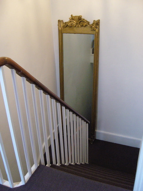
If you're lucky enough to have a beautiful, old staircase, chances are you want to preserve it and make it look it's best, but how? Gorgeous Interior Design Solutions for your staircaseWhich type of staircase do you prefer? Do you own a tired staircase? Want Expert Advice?As most of our projects involve the hallway (which not only has to be impactful and stylish but highly practical and on budget) over the years we've tackled staircases, landings and entryways of varying ages and conditions. Today we're offering you our five tips on how to beautify yours. 5 Ways to Design a Stunning Staircase1. Where to tart when decorating your staircase
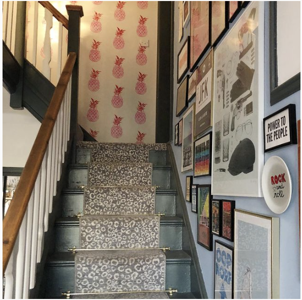
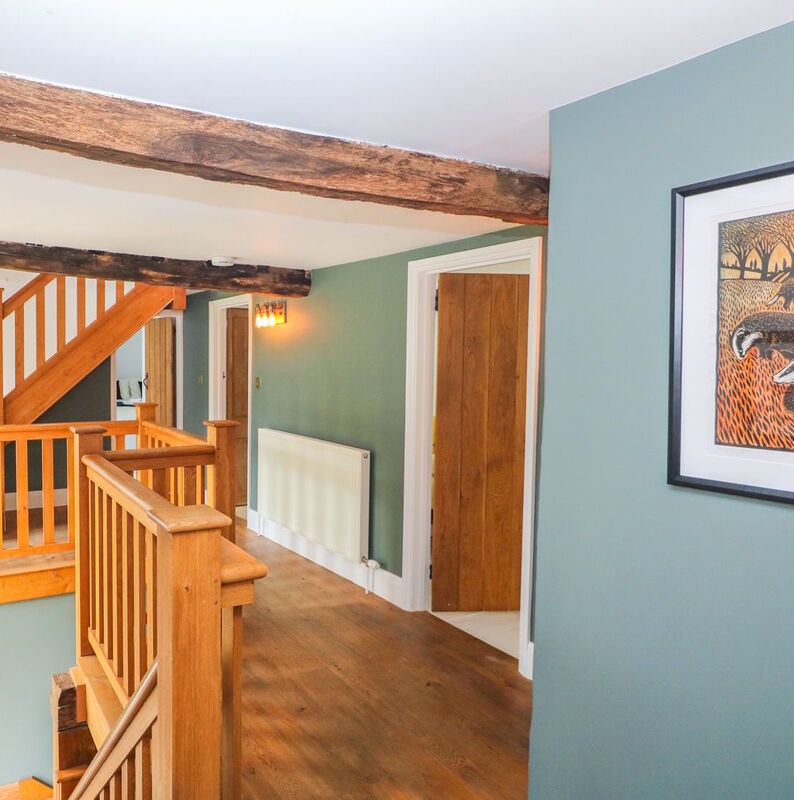
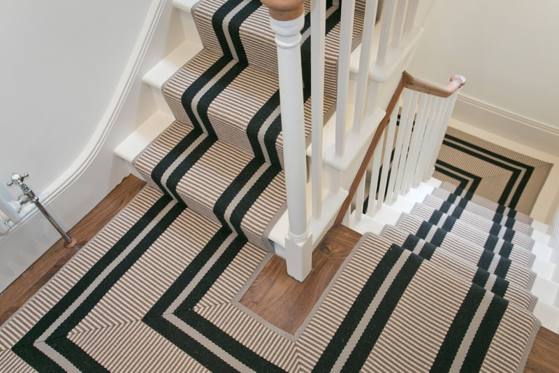
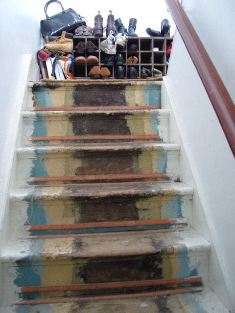
Establishing your budget is key as you need to know if you have £1,000 or £10,000. If it's the former you can hire a decorator to repaint the area but if it's the latter let's also get a top-end runner on those treads and risers. 2. How to hire tradespeople to renovate your stairs Unless you're a particularly good decorator with plenty of time, you're going to need help. Recommendation is the best way to find a trusted painter or carpenter so ask around your friends and neighbours who've recently had work done. Alternatively we have clients who have successfully hired through Check a Trade, Rated People and Houzz where you can read genuine reviews of work. 3. What is the best material to use on stairs Should you have an Oak staircase or your decor suits a more rustic/industrial/shabby look, you should get any repairs to dodgy steps, spindles and wobbly finials done and keep on top of the anti-slip, protective oil or vanish to show off the wood's true beauty. However, if you have a knackered pine staircase, with cold and slippery steps, carpet or a runner is needed. If fully carpeting only the banister and spindles need looking at but for a runner the treads and risers need either a full coverage of paint - a longer project OR you can just paint the sides, making sure to go a few cm into the carpeted area as the runner will cover the rest. Then there's edging - whipped Vs Tape edge. Whipping is the process of wrapping the cut edges of a carpet to stop them from fraying. Tape is made of fabric which is adhered to the edges and gives a more expensive look, because it is more expensive, but looks incredibly smart. 4. How to choose pattern and colour for halls and staircases If your walls have pattern on them a plain runner will keep the scheme in check. If a bolder look is your thing, then go for a clashing print in a neutral or harmonious colour. If the walls are bare, why? Stick a picture up at least! Then a patterned runner will give you the wow factor you're looking for. Pale colours make for a calm space whilst darker colours give you a richer and more impactful, chic entrance. Then the woodwork - white is a popular choice as it's timeless but our advice is to always go for an off-white which is less harsh on the eyes yet does the same job and is more sophisticated in our opinion. However if you want colour for a stand-out hallway, always pick a muted shade such as French Grey or Cerullian Blue unless you're like the lovely Siobhan from Interior Design Masters in which case go for it! 5. The Environment & Where To Buy Where possible choose natural fabrics for carpet such as wool or sisal and cotton tapes. Also use grippers and stair bars so that less adhesive is needed. For the walls look for low to no VOCs, water based paints such as Farrow and Ball and Little Greene, and with even stronger eco credentials Grafclean mid-sheen by Graphenstone which incorporates nano-technology for enhanced durability or Earthborn's Eggshell, just make sure to lightly sand and prime first. The Open Plan would love to hear about your staircase projects should you not want to tackle the job on your own We can help with a colour consultation, bespoke design advice and project management, so just drop us a line now.
0 Comments
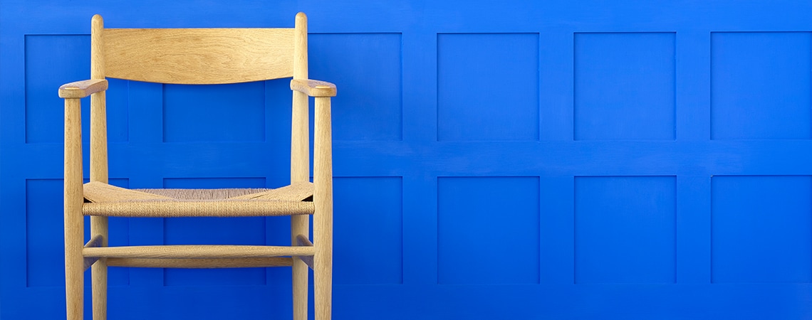
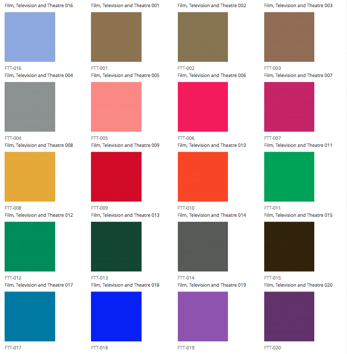
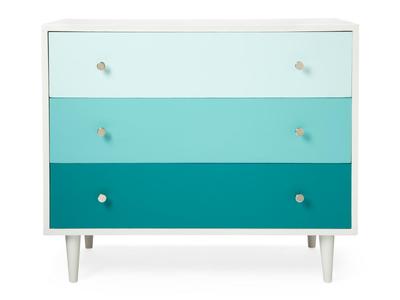
Are we excited? Yes! Let us show you the hottest new interior paint colour palette from Mylands who also happen to be one of our favourite paint companies We can see so many amazing possibilities for home and business interiors using this collection to add a pop of colour or a stunning all-over paint in these vivid hues and luxury metallic sheens. Imagine punchy yellow detail in the kitchen. Think pink panelling. Dream a silver and baby blue nursery.
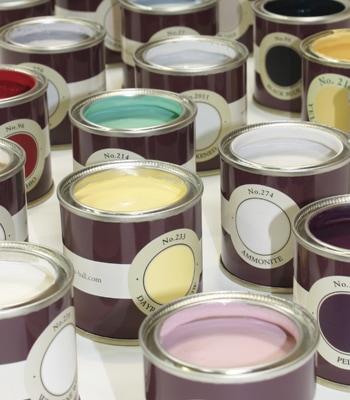
If you're loving these colours as much as we are but need a bit of advice on where and how to use them you can book a colour consultation or even a whole home/business design here. The Open Plan will help you to create spaces that are individual to you, show off your flair and personality and make the neighbours envious of your design prowess. Win Win Win! So now you're colour scheming like a pro? (You will be if you've read Parts 1-3) You've shortlisted a bunch of colours. Next stage is to test them out. Let's buy some sample pots. Save yourself time not money
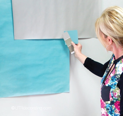
Too many times I've skimped by only buying 2-3 sample pots only to find that they're not quite right. Then it's back to the shop/website to buy another followed by yet another visit to buy one more - Argh! If you've got 5+ colours on your shortlist buy them all now. For the sake of another £4 per pot it'll save you so much time. Whilst you're at it buy a good quality roll of wallpaper lining paper too. Paint 'em up Here's where you need your lining paper. Take a good meter of paper per colour and paint the whole piece. Leave to dry. Now you have portable large-scale colour samples. Take each colour and stick them on the wall that receives the most light, then the darkest wall. If the paint will be on any horizontals such as shelves lay the samples down too. This will give you the best idea of how the colours look in the actual room and at different times of the day and under artificial light be it vibrant or dull, yellow or pink tinge, cold or warm. It's possible that you'll also spot colours which work better together immediately. Decision time You should by now know which colours to use so here's a paint calculator to help you get your paint quantities right but if you still haven't decided by now call us at The Open Plan as we'll be happy to help. Eco call! Should you have sample pots or paint left over please don't throw them out. Instead take a look at our post on decorating ideas with un-used paint. Alternatively, you can donate your paint to re-cycling schemes such as Community Repaint based at local refuse sites across London and the UK who will redistribute paint to worthy causes and even re-process old paint into brand new paint as well as recycle the plastic pots and tins. Do you find yourself staring blankly at paint charts, loving the bright yellow or charcoal grey but returning to beige and white in fear of having a custard coloured kitchen or dingy master bedroom? Part 3 of this guide walks you through how to work a paint chart and get experimental. Paint Charts - Let's turn these little booklets of confusion into pro-decorating tools. Easy as I, II, III
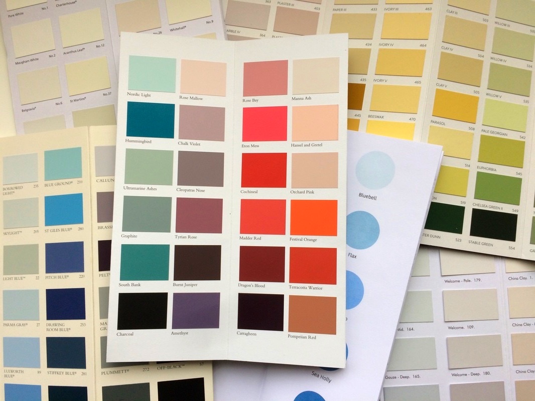
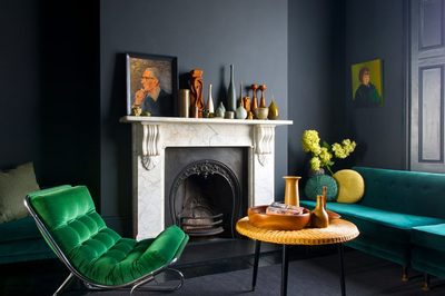
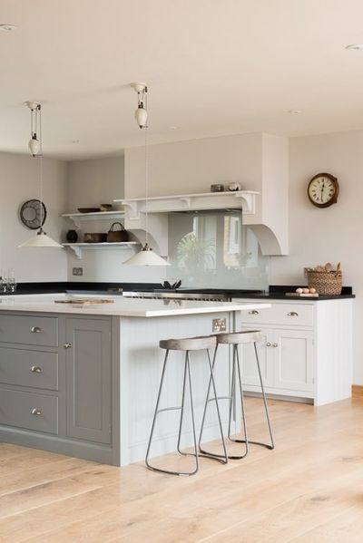
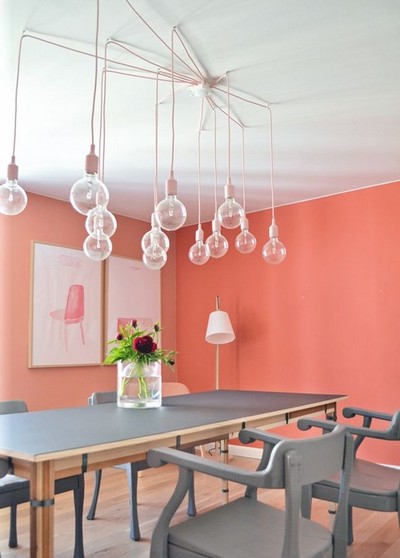
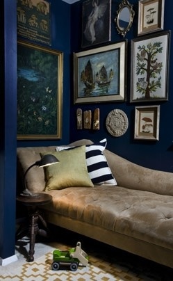
First, there are the easy to use tonal charts some of the best being Dulux, Little Greene, Paint and Paper Library and Bert and May. All of these group shades together making it easy to confidently choose several shades in seconds. From this you can allocate a different shade to different areas and items in the room - easy! If you then want a stronger shade just dip into the darker colours on the chart. For example, Paint and Paper's Plaster I-V would go brilliantly with a shock of Rhubarb and Little Greene's French Grey shades would sit perfectly with anything from Green Verditer to Atomic Red. Cut it Up Now cut up your paint chart making sure to keep the colour name with the paint chip. This is preferable to wrestling with a paint chart trying to get two colours to meet up. Then have fun placing the colour chips in pleasing groups on a white piece of card or paper which'll help you see their true colours. You'd be surprised how dark an off-white can look against pure white. To make life even easier take the chips that match your inspiration image (see blog Parts 1 & 2) and assemble them. Now you're getting somewhere. Don't be afraid to use several paint charts to find the colours you need, just make sure that you keep tabs on which charts the chips came from. Larger samples If you can get the paint stores in question, then you'll be able to play with their larger showroom samples. Upsizing your paint chips and seeing the colour as a larger expanse really helps you to decide on your colours. Most of the boutique paint shops offer this option and have well trained staff to help you in the decision making process. I do this all the time, so you should too. I wasn't planning on it but think I'll do a Part 4 - Sample Pots watch out for it..... Colour schemes - Do you really know what a colour scheme is and even if you do where do you start? Well I'm going to share some trade tips over my next few posts which'll help to transform and enhance your home or business. As a trained colour consultant, I am in my element playing with colours and making them work in a space so I thought I'd let you in on some of the tricks I've learnt over the years. Taking Inspiration from Nature Look at the flora and fauna around you, country, parks, beaches, skies, shells, animals, there are an infinite amount of colour combinations out there but here are some ideas to start you off Mountain - Just imagine a forest green velvet sofa, with charcoal cushions floorboards with pale grey walls with moody sky blue and light green accessories. This scheme would also work for a jungle themed room Arctic - Icy blues and fresh whites riven with grey veins makes a perfect colour scheme for a kitchen with marble tops, painted cupboards and gr-eige accents. Also note the icy clear glass splash-back. Flamingo - A very on-trend colour scheme from the most kitsch and colourful flamingo. Use this colour everywhere from colour-pop skirting boards and doors to duvet covers and kitchen cupboards. Mix with brown toned neutrals (ala flamingo chick) and some white and grey to anchor the room. Mallard - One of my faves. This bird has plenty of safe neutrals to play with but the shocking cobalt blue and emerald green would work perfectly on mass as in the walls pictured above or as highlights in cushions, silk lampshades and rugs. Seaside - The seaside is full of colourful ideas. For a bold room you could paint the entire room orange and have neutral furniture and green accents or like the second picture where the feature piece enlivens a room set against natural colours and a hint of sea green to create a rustic and calm space.
So look around you, look at favourite nature prints and paintings and notice the harmonious colours, which will have been a big part of what drew you to the place/image in the first place, then translate into your space. Well that was easy. Thanks nature! Find our second part on 'how to create a colour scheme' soon and in the meantime contact us should you need more help |
AuthorOne of London's Best Interiors Bloggers (Ideal Home magazine), The Open Plan Interior Design, London produces contemporary interiors for homes and business' and this very useful home interiors blog Archives
July 2023
Categories
All
|







 RSS Feed